website redesign
GoodBelly had strong product and brand recognition, especially in the natural foods / probiotic drinks space—but their website was holding them (and users) back in several key ways:
Key challenges included:
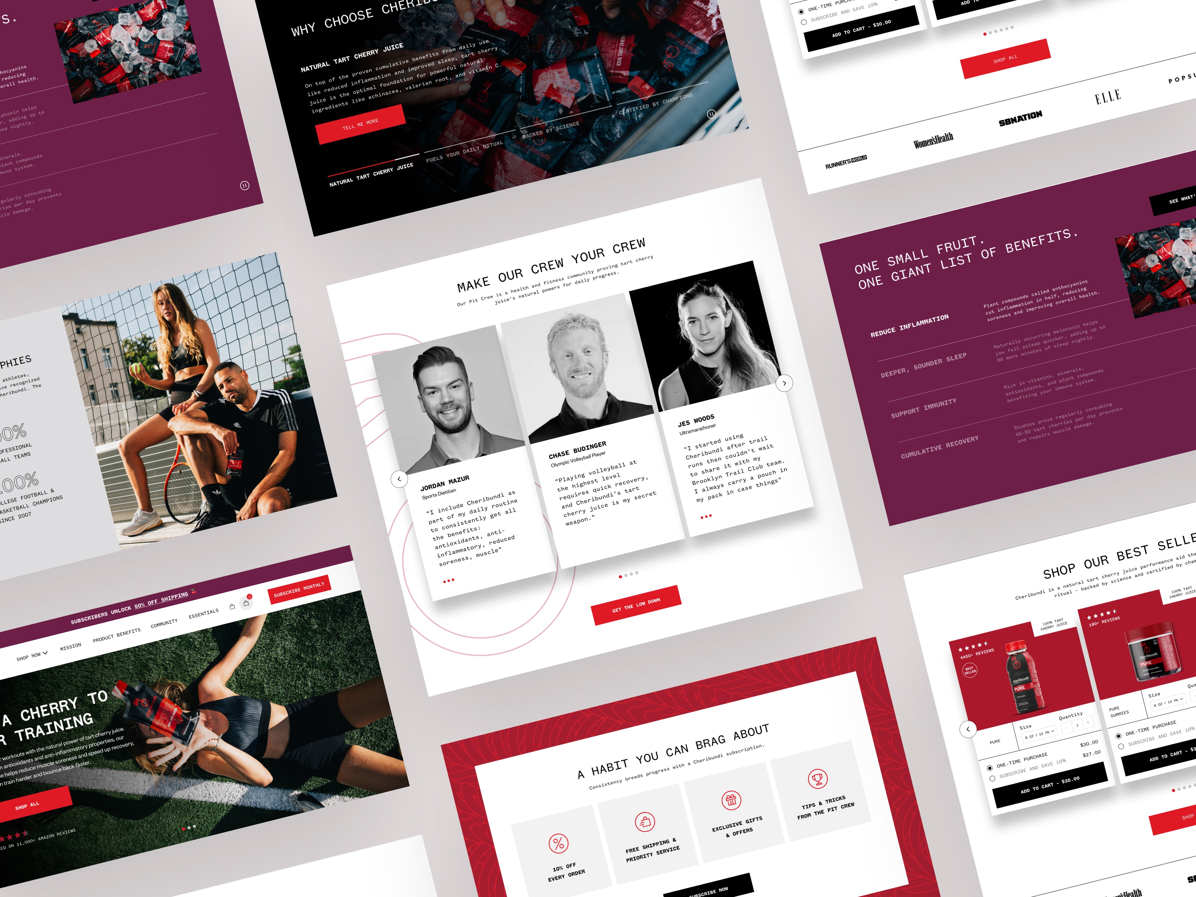
The visual design and branding felt dated and inconsistent.
The site’s information hierarchy made it difficult for users to navigate or understand the product range.
Visuals lacked depth and failed to communicate the freshness or flavor of the products.
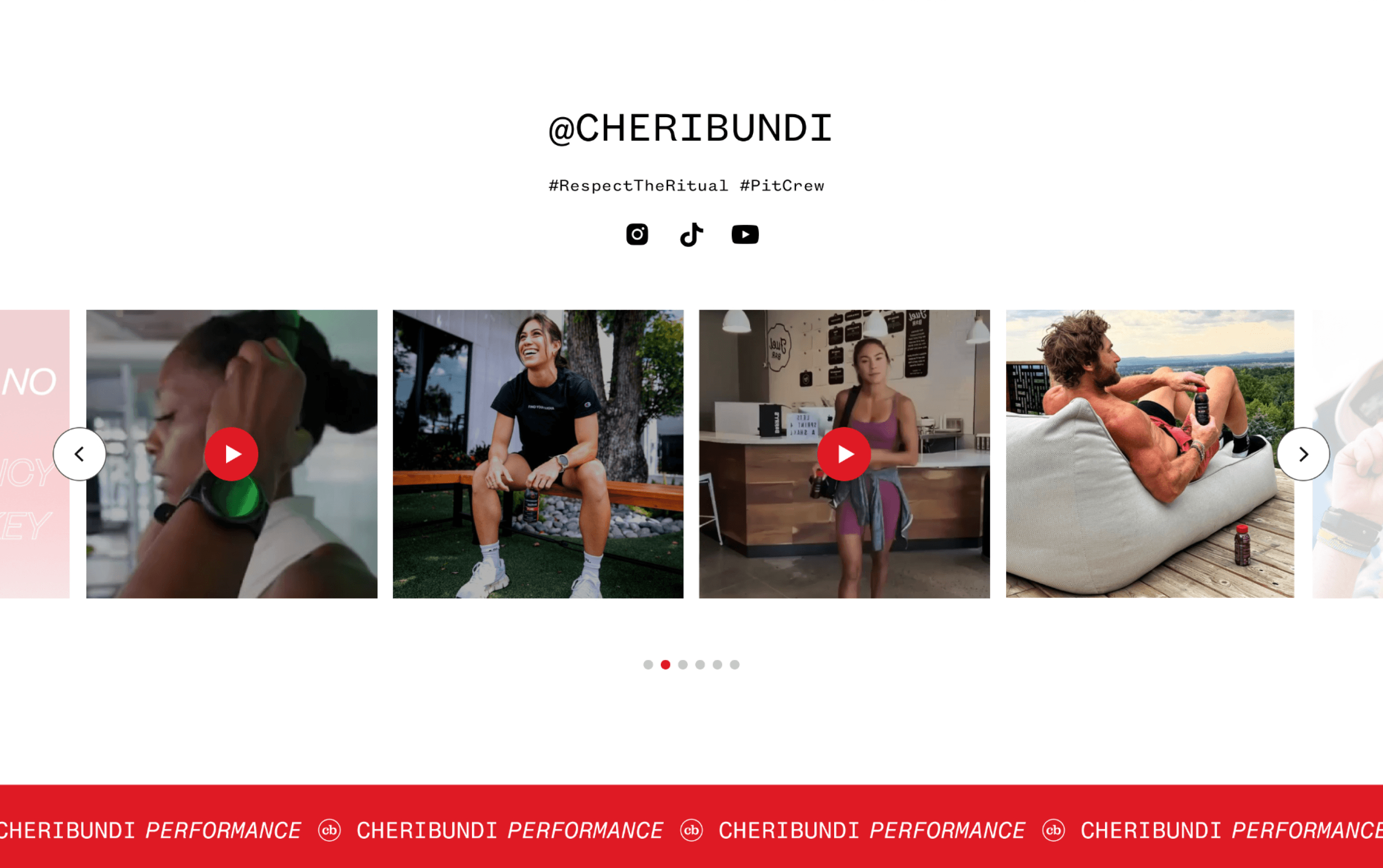
Limited interactivity and engagement opportunities left users passive rather than curious.
The mobile experience was clunky, with poor responsiveness and accessibility issues.
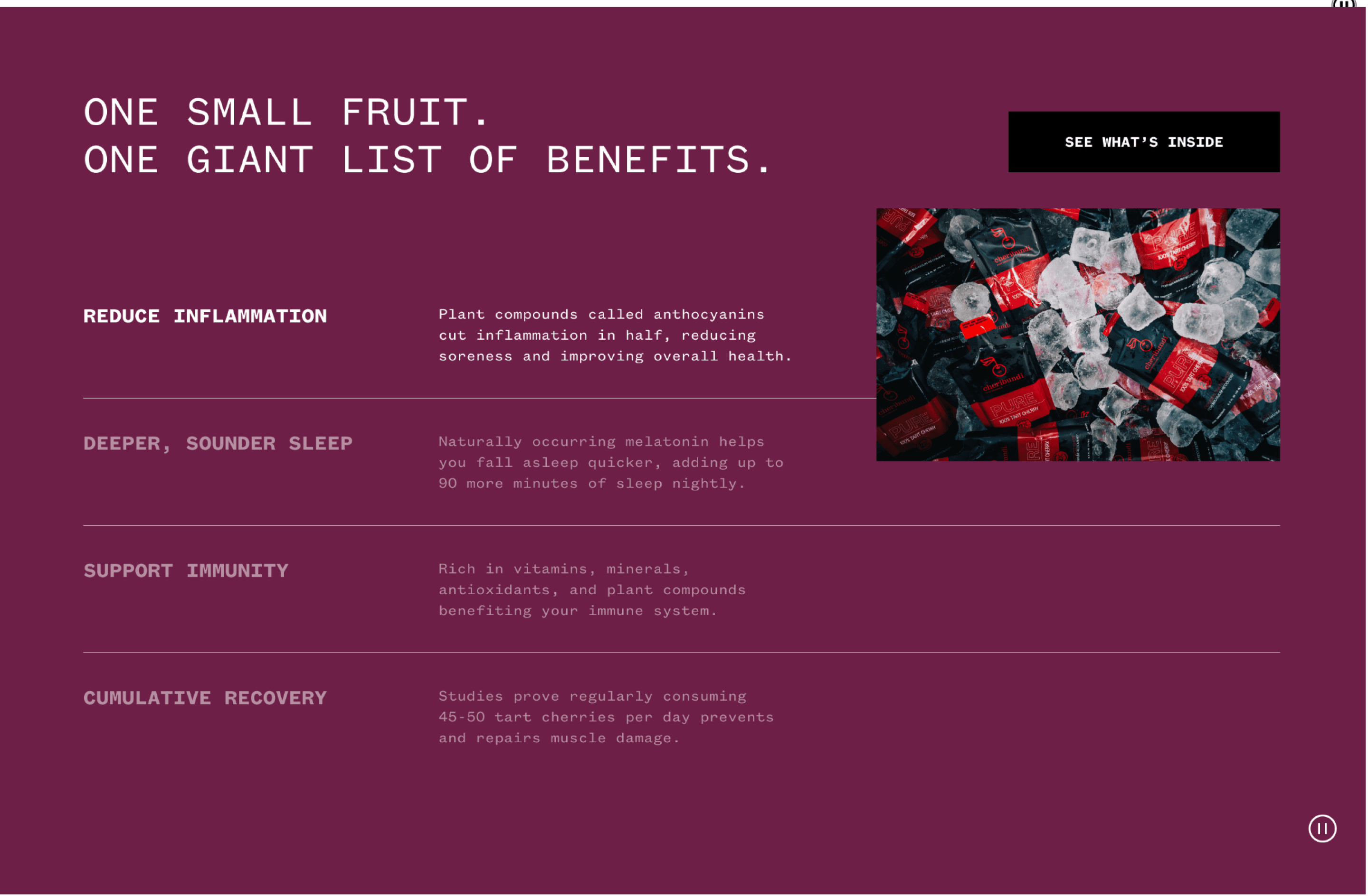
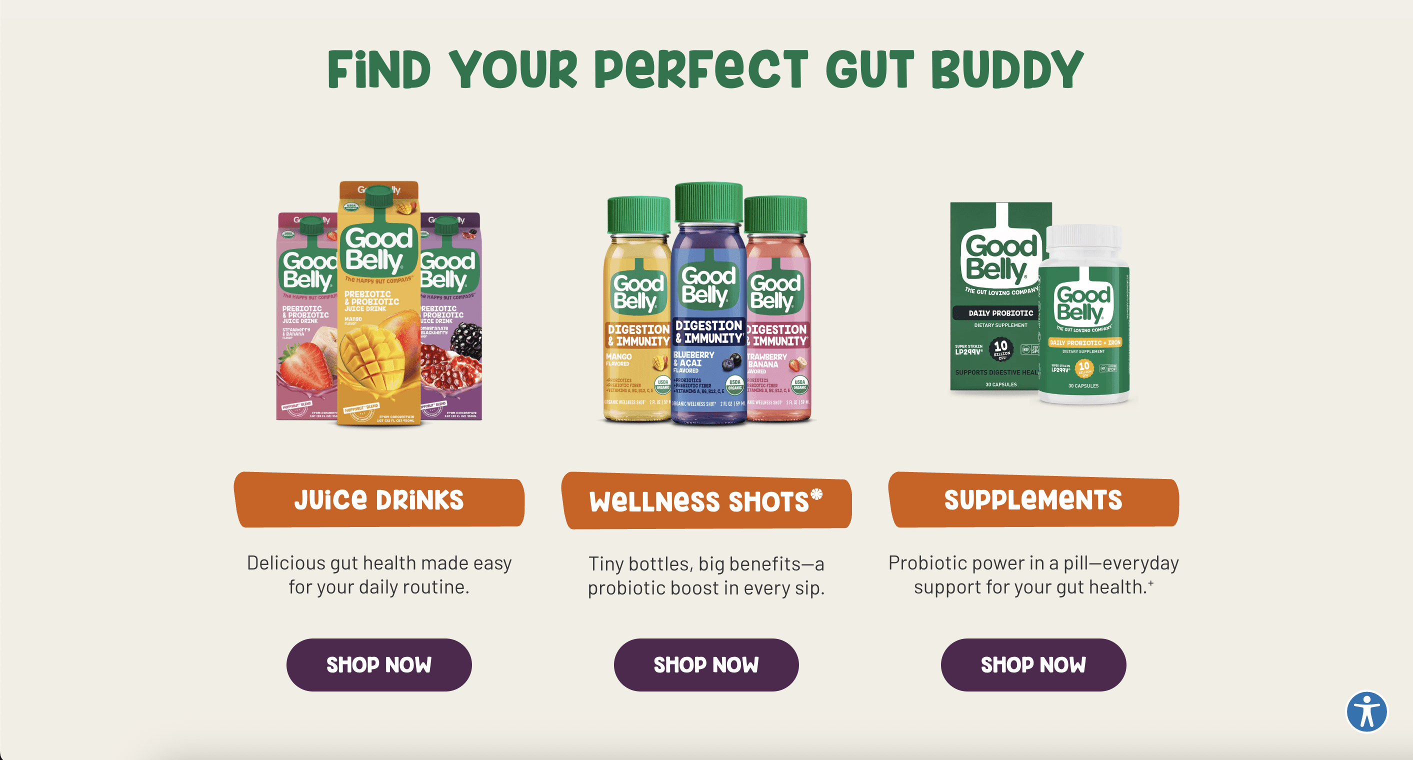
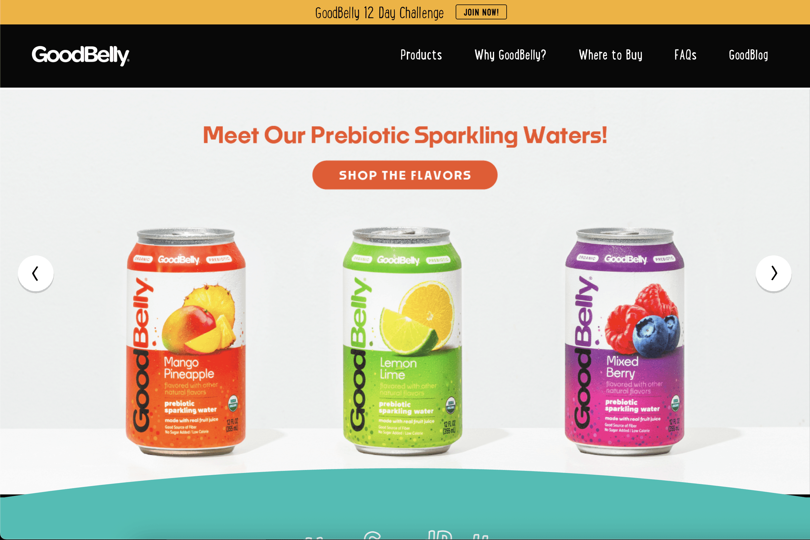
I restructured the homepage around a clearer hierarchy that guided users from brand story to product discovery with less friction. The new design emphasized GoodBelly’s energetic personality through bold colors, playful imagery, and clean typography that aligned with its packaging and tone of voice.
To boost engagement, I introduced interactive product carousels, simplified navigation, and stronger calls to action. The site was fully redesigned to be responsive and accessible across devices, creating a seamless experience that felt fresh, consistent, and true to the brand.

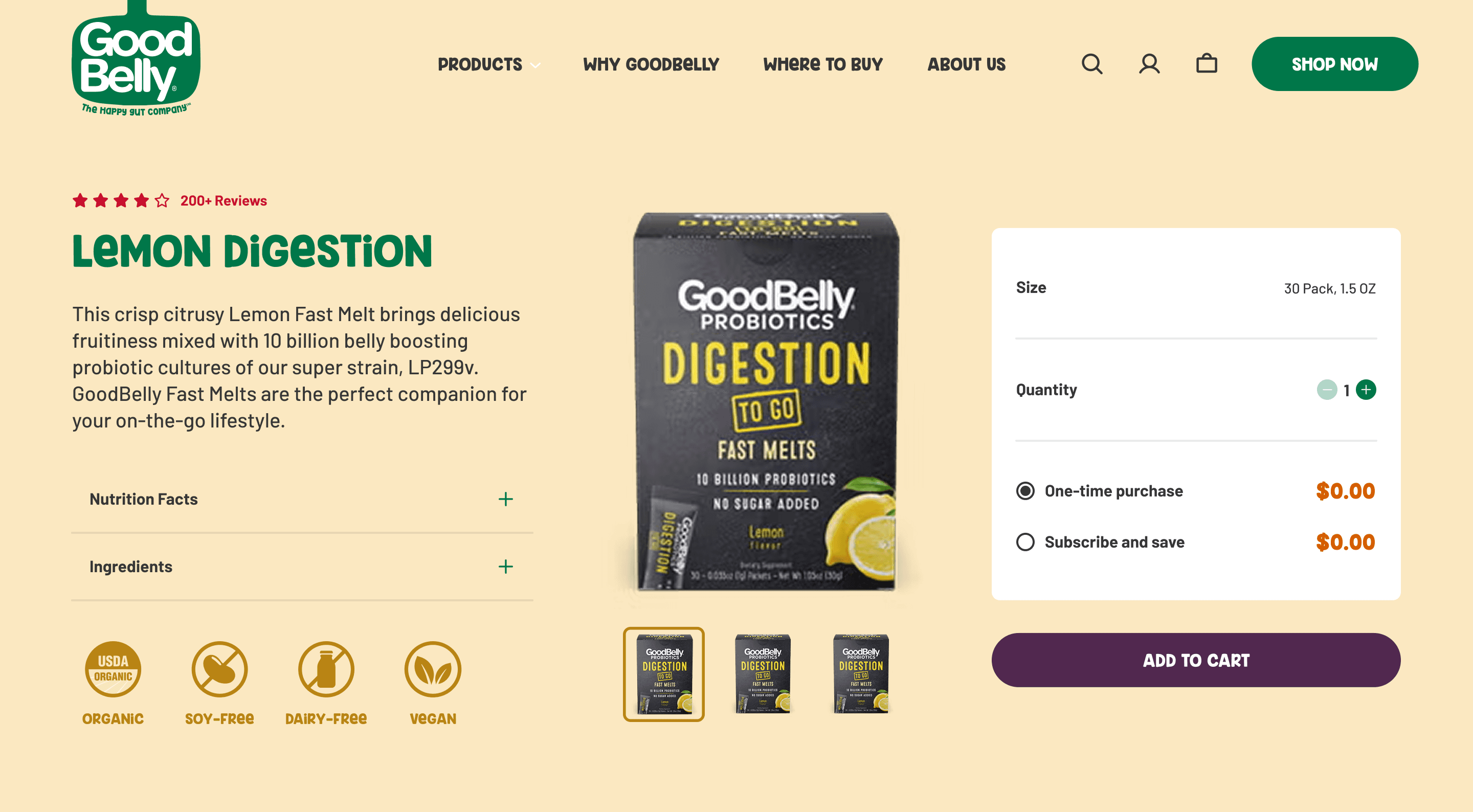
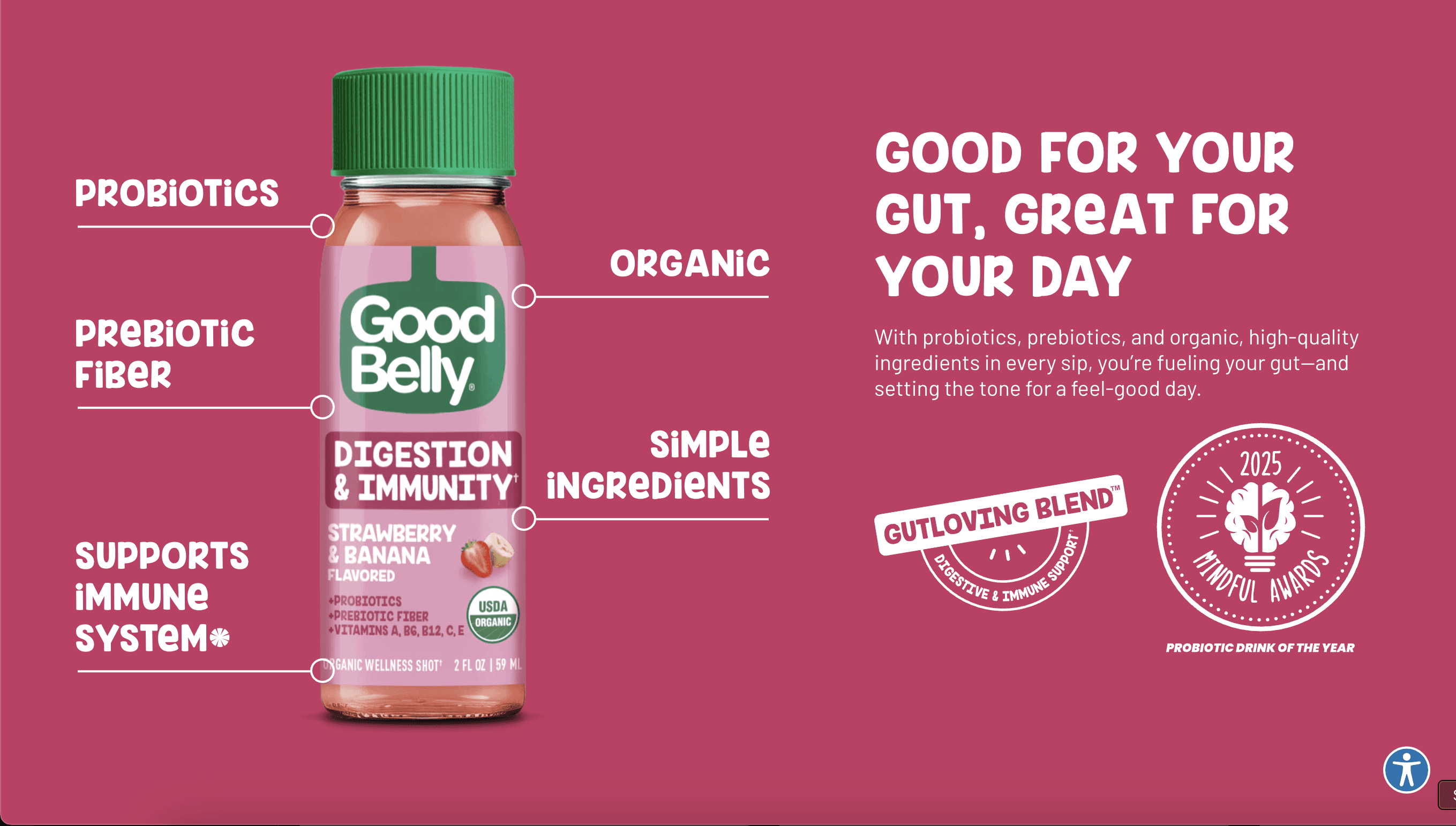
PDP
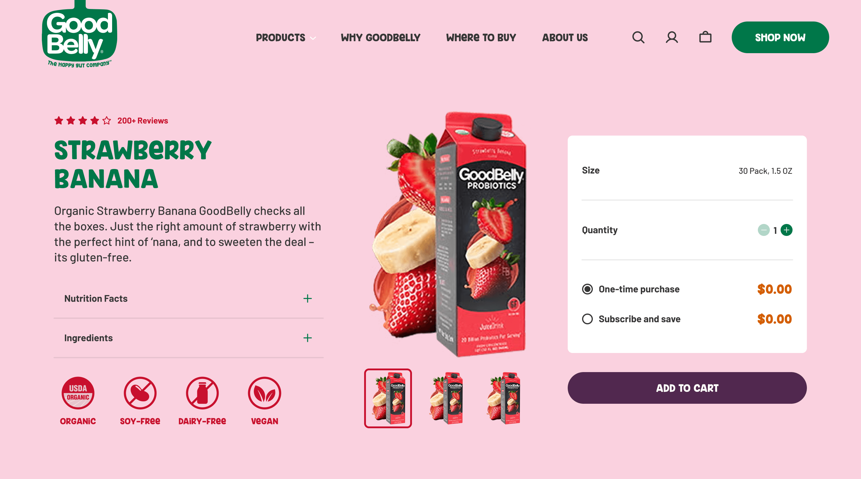
PDP
The redesign transformed GoodBelly’s website into a lively, intuitive experience that better reflected the brand’s personality and helped users connect more easily with its products.
Key improvements included:
A cleaner layout with clear visual hierarchy made information easier to scan and digest.
Simplified navigation and bolder CTAs guided users toward key actions more efficiently.
A unified brand system tied typography, color, and imagery together cohesively.
Interactive features boosted engagement and encouraged deeper exploration.
Mobile optimization delivered a seamless, accessible experience across devices.