
website redesign
website redesign
Shores Cleaners
Shores Cleaners
Shores Cleaners
The new Shores Cleaners site transforms a traditional dry cleaning business into a polished, mobile-friendly experience that communicates trust, craftsmanship, and care at every touchpoint.
The new Shores Cleaners site transforms a traditional dry cleaning business into a polished, mobile-friendly experience that communicates trust, craftsmanship, and care at every touchpoint.
The new Shores Cleaners site transforms a traditional dry cleaning business into a polished, mobile-friendly experience that communicates trust, craftsmanship, and care at every touchpoint.

The Challenge
The Challenge
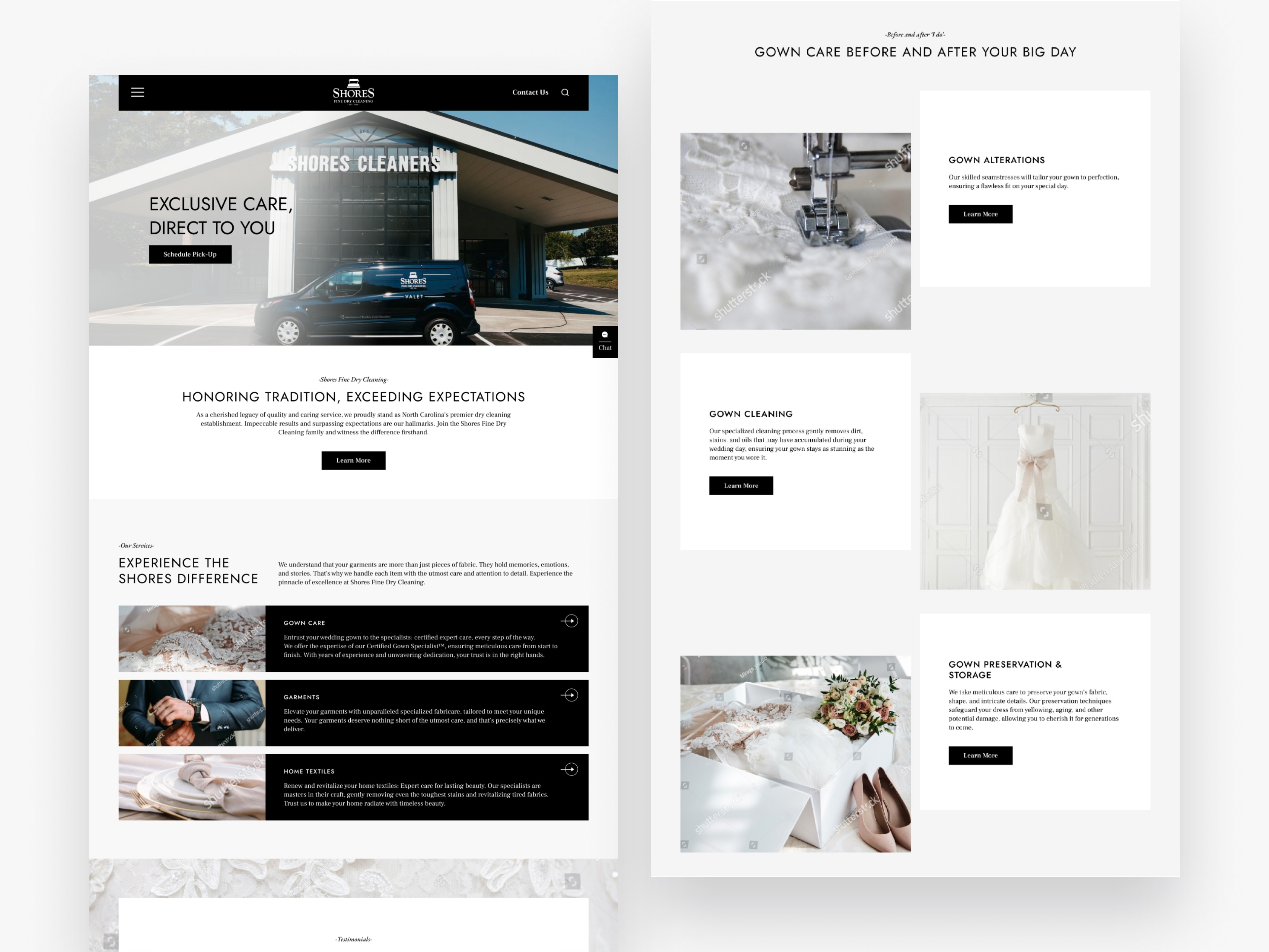
Shores Fine Dry Cleaning had built decades of local reputation around excellence, but its digital presence was no longer keeping pace. The previous site was dense with text, lacked visual hierarchy, and didn’t communicate the premium care, specialization, or trust that clients expect from a heritage garment care provider. Users struggled to quickly find key services (gown care, home textiles, specialty items) or get in touch, especially on mobile.
Shores Fine Dry Cleaning had built decades of local reputation around excellence, but its digital presence was no longer keeping pace. The previous site was dense with text, lacked visual hierarchy, and didn’t communicate the premium care, specialization, or trust that clients expect from a heritage garment care provider. Users struggled to quickly find key services (gown care, home textiles, specialty items) or get in touch, especially on mobile.
The Approach
The Approach
I reworked the information architecture to center around users’ primary goals—discovering service types, learning certification and trust factors, and contacting a specialist. Rather than long paragraphs, content was reorganized into clear, scannable sections with strong headings, calls to action, and supporting imagery to reflect the care and craft of Shores. Visual cohesion was reinforced through consistent typography, a refined color palette, and photographic / illustrative accents to highlight fabrics and process.
I reworked the information architecture to center around users’ primary goals—discovering service types, learning certification and trust factors, and contacting a specialist. Rather than long paragraphs, content was reorganized into clear, scannable sections with strong headings, calls to action, and supporting imagery to reflect the care and craft of Shores. Visual cohesion was reinforced through consistent typography, a refined color palette, and photographic / illustrative accents to highlight fabrics and process.
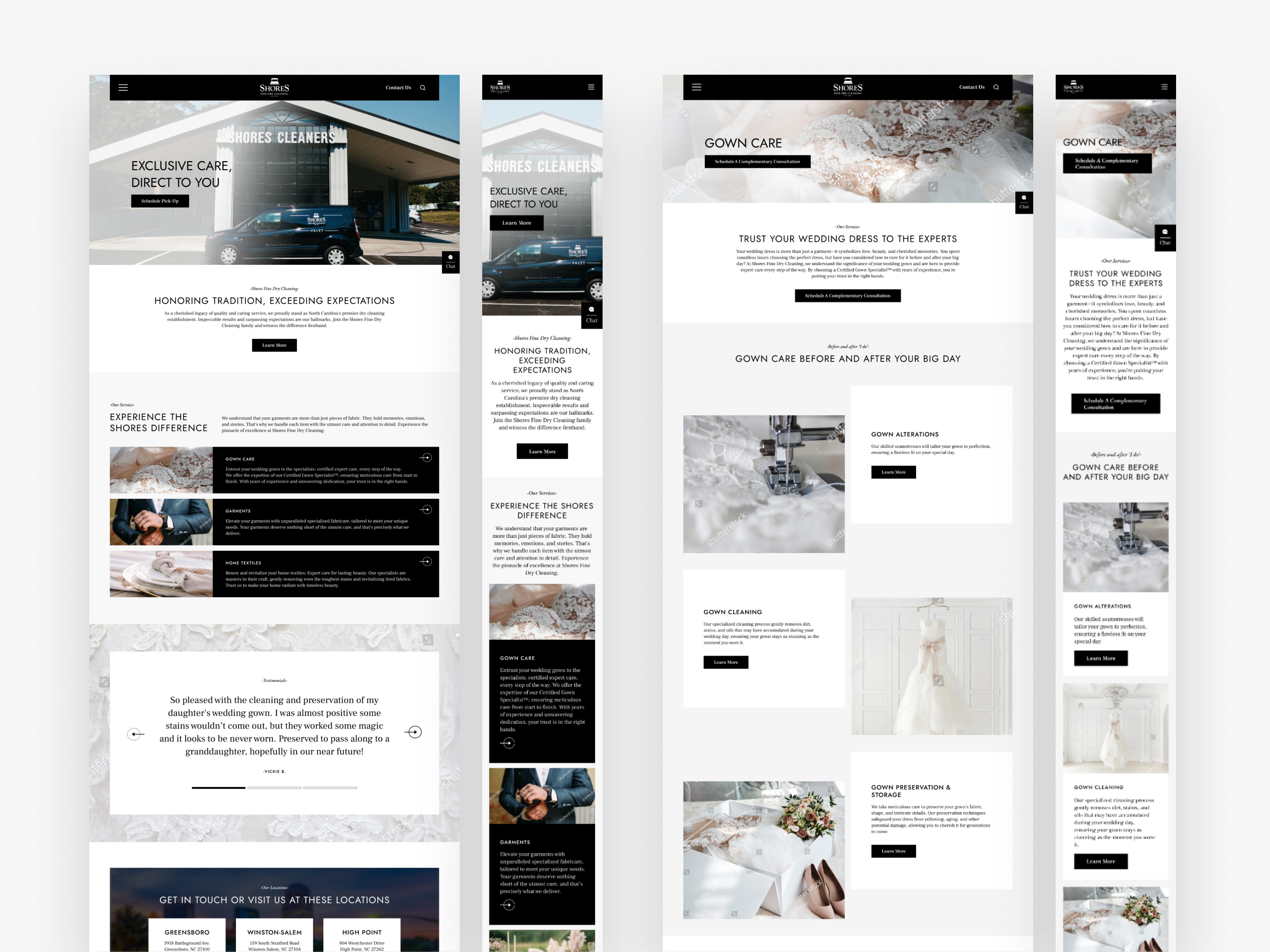
To improve usability and engagement, I simplified navigation, surfaced the AWGS certification and wedding gown specialization more prominently, and made core CTAs and contact forms more accessible. I delivered responsive prototypes to ensure that the experience would remain seamless and legible across desktop, tablet, and mobile.
To improve usability and engagement, I simplified navigation, surfaced the AWGS certification and wedding gown specialization more prominently, and made core CTAs and contact forms more accessible. I delivered responsive prototypes to ensure that the experience would remain seamless and legible across desktop, tablet, and mobile.
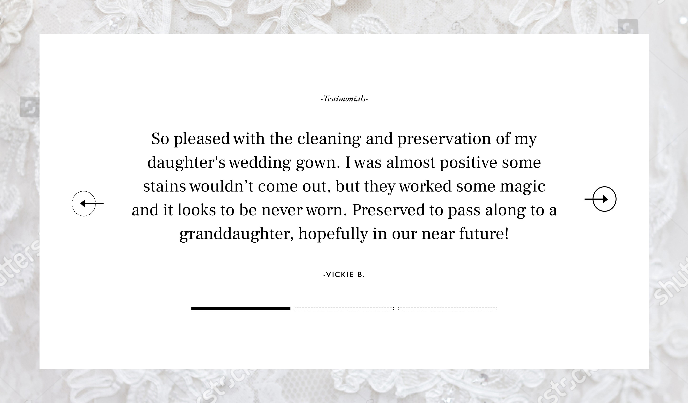
Testimonial carousel
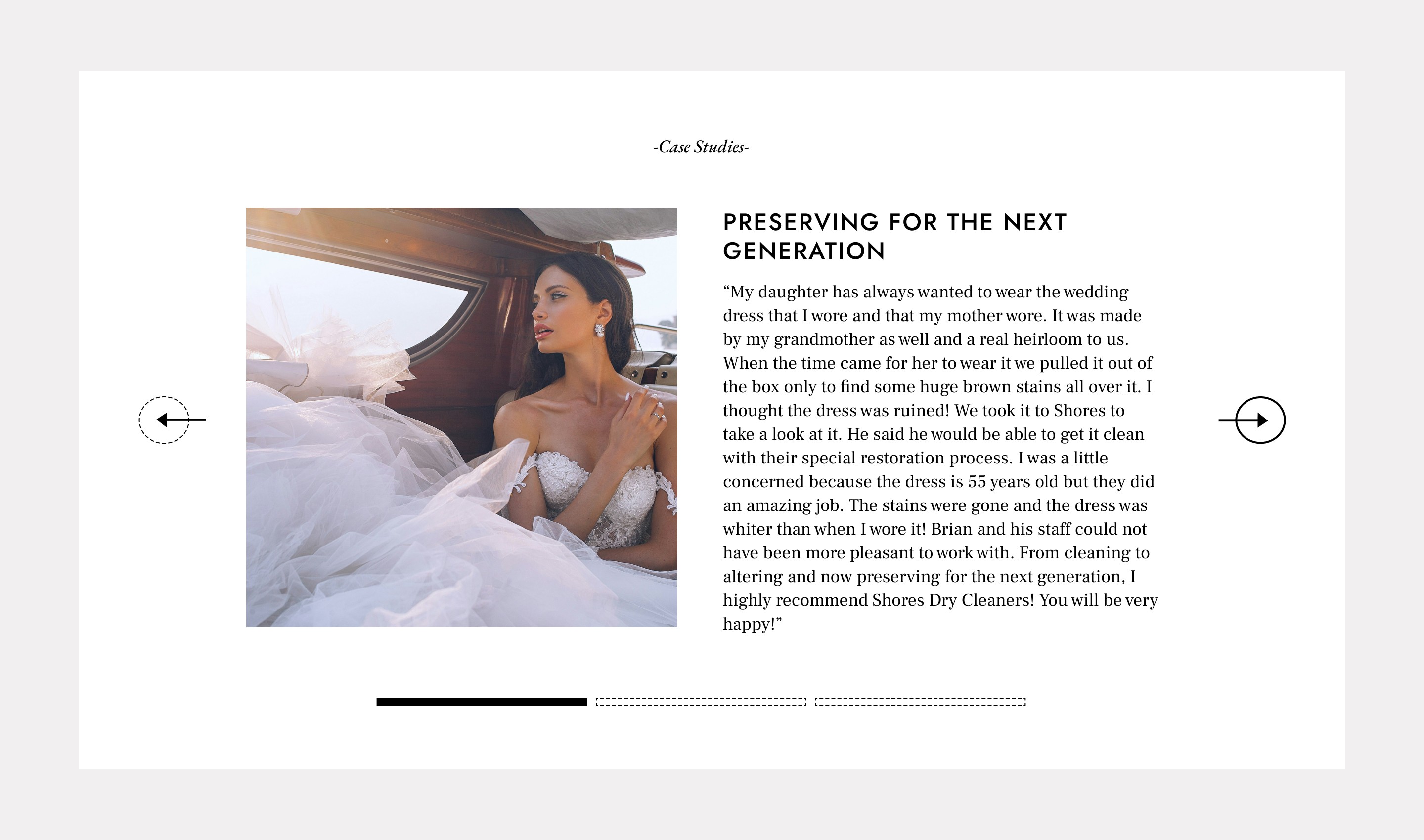
Testimonial carousel with image
The Solution
The Solution
The new Shores Cleaners site now projects the premium, trusted service that the brand is known for, while improving clarity, usability, and engagement for new and existing customers.
The new Shores Cleaners site now projects the premium, trusted service that the brand is known for, while improving clarity, usability, and engagement for new and existing customers.
Key improvements included:
–
A cleaner, more organized layout helps users quickly identify core services.
Clean layout with stronger use of white space
–
Navigation and service flows are simplified, leading users where they need to go without friction.
Clear calls-to-action and simplified navigation
–
Certification, specialization, and brand trust are visually and structurally emphasized.
Consistent branding and cohesive visual language
–
The updated visual language (typography, imagery, spacing) elevates the brand’s perceived quality.
Interactive elements that boosted user engagement
–
Fully responsive design ensures clarity and accessibility on all devices.
Seamless experience across desktop and mobile

Related Projects
Related Projects


9
:
41

9
:
41


9
:
41
9
:
41


9
:
41
9
:
41